Last month I was looking for a new TV unit (I’ve once again changed the ‘theme’ of my living room) and I was trying to book an appointment at a place that, by all accounts, is really lovely. Beautiful shopfront, very aesthetically pleasing Instagram account. You can tell the brand spent real money on its identity.
Then I clicked “Book Now” and landed somewhere else entirely. A plain white page, a stack of grey text links, and a font that looked like it had wandered in from an early 2010s spreadsheet. There was no logo, no brand colours, and no sense that I was still, technically, on the same website.
I didn’t cancel, but I paused. I wondered, ‘Is this still them?’
It’s that flicker of doubt that’s worth paying attention to, and not because of one lost booking.
Why booking pages matter more than people think
Nobody designs their booking page on purpose. Not really. Someone builds the beautiful homepage, the polished product pages, the Instagram grid that could win awards. Then the booking page gets bolted on at the end, because customers need to book, and it works, so it ships.
Except the booking page isn’t a footnote. It’s the moment a browser becomes a customer, the last thing someone sees before they hand over their time, money, and often their card details. If your homepage is the flirting, then your booking page is the actual commitment.
Treating it like an afterthought is a bit like a five-star hotel that nails the lobby, the bar, the service, and then makes you check in at a portacabin round the back.
The hidden cost of a booking page that doesn’t match
A jewellery brand spends months perfecting the in-store experience: the lighting, the velvet trays, the way a sales associate lets a ring catch the light just so. Then the online booking page for a resizing appointment looks like it’s asking you to renew a parking permit.
A beauty brand builds a whole world around glow and confidence, but the booking form for a facial has all the warmth of a dentist’s cancellation policy.
Neither brand is doing anything wrong on purpose; they’ve just never thought of the booking page as part of the brand at all. But customers don’t separate “the bit that looks like you” from “the bit where I actually book.” To them, it’s all one experience.
To be fair to the sceptics: few customers consciously cancel a booking because a page looks dated. That’s a real overclaim to avoid. But moments of uncertainty still add friction, and friction chips away at conversion, even when nobody can point to the exact moment it happened. It shows up as a slightly lower completion rate, not a dramatic exit.
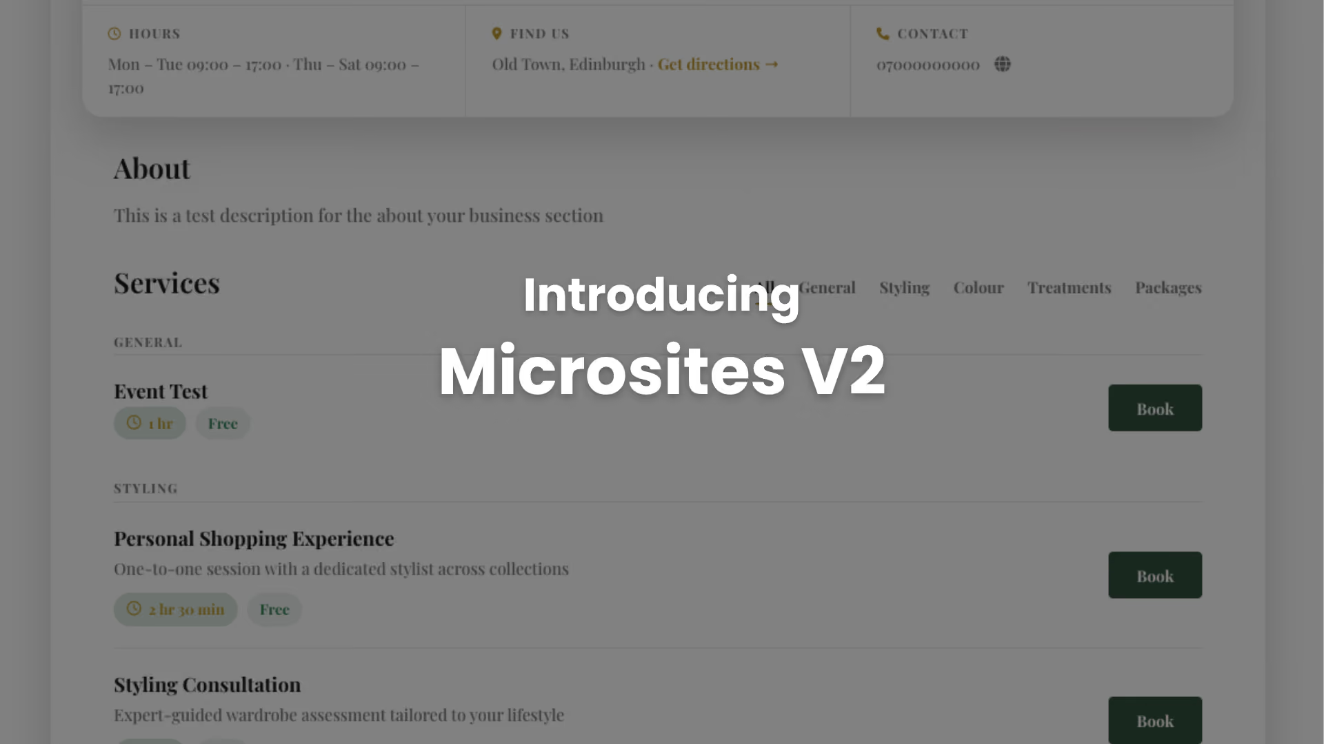
Introducing Microsites V2
This is exactly why we’ve rebuilt our Microsites.
If you’ve ever sent a customer to book with you, they’ve landed on a microsite: your Appointedd booking page. The place where booking turns into an actual appointment. Microsites 2 is a full visual and accessibility overhaul of that page, the same booking functionality your customers already use, wrapped in something that finally looks like it belongs to you.
The best part: you don’t need to do anything. Your services, pricing, and availability carry over exactly as they are. Your existing microsite link keeps working. Your current branding carries across automatically. If you want to go further, design changes can be made in the Enterprise Management Console (admins only) at console.appointedd.com.
What’s changing and why it’s worth something to your business.
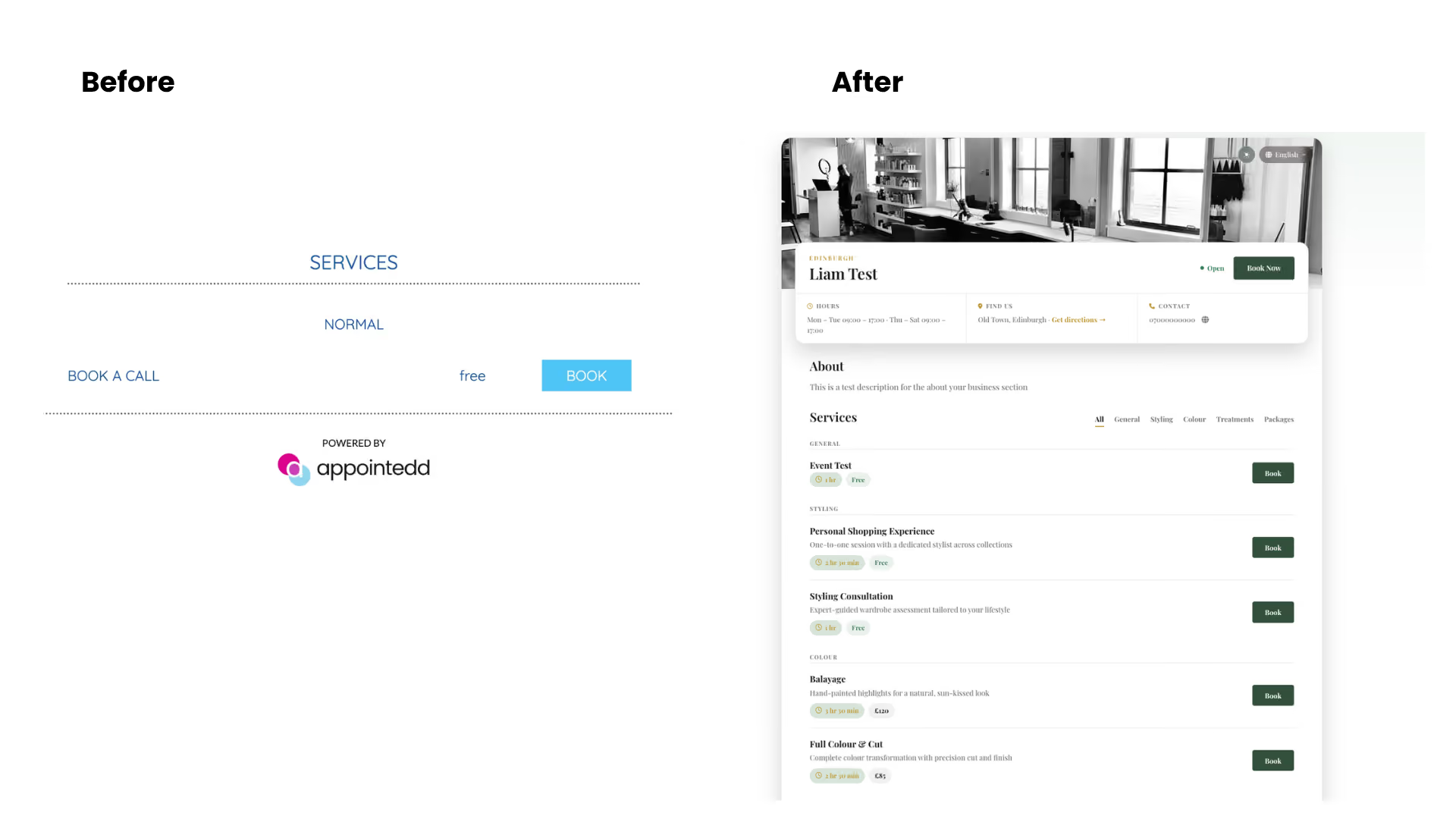
Out goes the plain list of services with prices trailing off into a sidebar. In comes a hero banner, your business name and brand front and centre, alongside a “Book Now” button you can’t miss. For a business relying on that page to convert traffic you’ve already paid to attract, a clearer call to action is the difference between a click and a bounce.
Services are now grouped into browsable categories instead of one long scroll, each one shown as its own card, with duration and price clearly tagged, and a dedicated Book button sitting right next to it. If you run a business with a long menu of services, this is the difference between a customer finding what they want in seconds, and giving up after scrolling halfway down the page.
The info bar at the top now shows your hours, address with a “get directions” link, phone number, and a live open-or-closed status. That last one sounds small. In practice, it answers “are they even open right now” before the customer has to phone and ask, which is one less interruption for your team and one less reason for a customer to close the tab and forget to come back.
There’s a language selector for customers who’d rather browse in their own language, useful for any business drawing an international footfall, and a choice between light and dark mode, so the page doesn’t glare at someone browsing at 11pm the way a stark white background does.
Accessibility is a retail responsibility, not a technical footnote
The new microsites meet WCAG 2.4.7 focus visibility guidance. In practice, that means a customer navigating with a keyboard or assistive technology can always see exactly where they are on the page.
It’s easy to file this under “nice to have.” But it shouldn’t be. For a meaningful number of customers, this is the difference between completing a booking and giving up on your site entirely, not because they didn’t want to book, but because they physically couldn’t get through the form. That’s not an edge case worth an apologetic footnote but a customer you were about to lose for a reason that had nothing to do with your product.
Yes, it works on your phone
Most bookings happen on a phone, not a desktop browser, so this wasn’t an afterthought. The new design carries the same responsiveness across mobile and desktop, which matters more than almost anything else on this list given where your customers are actually tapping “Book Now.”
The booking journey, before and after
Here’s roughly what changes for the person on the other end.
Before: customer lands on the page, faces a long scrolling list of services with no obvious grouping, isn’t sure which one applies to them, and closes the tab to “come back later” (they often don’t).
Now: customer lands, picks a category, sees the relevant services immediately with price and duration attached, and books.
Fewer decisions, less scrolling, less second-guessing. It creates a shorter path between “interested” and “booked”.
Why this is worth caring about, not just admiring
A booked customer is already a different class of customer to a browser. Someone who’s put a specific time in their diary to see you has told you more about their intent than almost any other action on your website.
A booking page with friction (however minor) works against a customer who has already all but decided to buy. Microsites V2 doesn’t change how likely someone is to book with you, but it removes some of the small reasons they might not finish doing it.
A few quick answers before you ask
Do I need to do anything? No. The update applies automatically and your existing branding, services, and pricing carry over unchanged.
Will my microsite link change? No. The link your customers already use keeps working exactly as it does now.
Can I customise the new design further? Yes, via the Enterprise Management Console at console.appointedd.com. That’s admin access only.
When does it roll out? Next week! Keep an eye on your inbox and the support centre if you want more information.
The takeaway
Your booking page has probably been doing more talking about your brand than anyone gave it credit for, and not always saying the right things. Microsites V2 gives it something better to say, and gives your customers one less reason to hesitate on the way to a “yes.”